skip to main |
skip to sidebar
For this workshop we were asked to prepare an A1 canvas and to bring in paints, oil or acrylic colours but NO black or white.
We were given a bag of foam shapes and asked to prepare either a 3D composition using wire or to make a flat composition on a white sheet of paper, i chose the flat piece and i don't really like working from 3D objects.
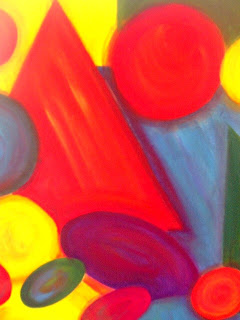
Here is my composition...
 I have layered the shapes to create depth and tried to cover the whole white paper so i wouldn't have to deal with 'white' background showing through, where there is slight amounts showing, i drew the shapes on larger to eliminate this.
Unfortunately (being the wally i am) i forgot to document the on-going process while i was building the layers up, however, i started by making a yellow wash and drawing on the shapes lightly with the paint. Then basically using the colours i had with me, added washes to the shapes using the corresponding colours. I didn't really get that much done during the day and come the end of the lesson wasn't really taken with my effort so far.
Yesterday at home however, i built up the painting, having previously bought better colours and paints from Studio Arts in town.I kept referring to Howard Hodgkin and the style he paints in to try and make something decent of my painting. This is not what i would normally choose to paint at all and i kept feeling disappointed in myself at the direction the painting was going in, i knew it needed 'something' to bring it to life.
I experiment with brush strokes and building similar colours up over each other, instead of just painting in block colour, in a sense it added tone and depth to the piece.


 Here in these images you can see the colours layered over each other and the quite 'brushy' lines still evident.
 While i was completing this painting i was looking at artists such as Howard Hodgkin and Mark Rothko who both use copious amounts of colour in their work, they are renowned for their use of colour in their painting styles. In particular i studied Hodgkin's brush movements and his layerings of colours and replicated this on the shapes so they didnt just sit flat on the canvas. I varied the brush sizes as well to give a greater definition to some of the marks. Hodgkin's has a very unique painting style though, so it wasn't a case of trying to copy him, more of taking his style and adapting in in my own work to a lesser extent. Here are some examples of their work....
 Howard Hodgkin
 Howard Hodgkin
This morning i started my final piece in response to the Soutine Painting. Using a viewfinder i reduced the original image to this, as i felt that even though the painting had been dramatically reduced, that there was still enough information within this reduced version to still grasp the painting.
 Side of Beef and Calf's Head by Chaim Soutine. Oil on canvas 92x73cm 1923
So this above smaller version is what i have been concentrating on whist completing a painted study of the piece. For this last final attempt, i cut down the A1 mount to A2 size and instantly knew that this scale was much better for me to work on. I started off as usual, defining the darkest area and then building up tone with burnt sienna and then going over the tone with its matching colour counterpart, working over the image as a whole instead of just concentrating on one area at a time.

 Gradually i built up the carcass area, using the colours to match the undertones....
 And kept on going, trying to concentrate on the lines to build up the tones and colour to create the image.

 Then i spent the rest of the time building it up more and more, using varied brushes to create differing lines,

 I am going to go back to this piece in a few days, as just looking at it now, i can see areas i'm not happy with, and it gives me a chance to reassess the piece with fresher eyes. But here is the piece so far in its entirety....

 Comparing it to the Soutine, i can see his tones are less vibrant than what i have created in my piece, so i feel a re-visit is needed in a few days....just to touch it up.
This afternoon i decided to start my final piece, choosing to use the whole A1 mount card, which turned out to be mistake!!!!!
I started by defining the black areas.... Then using orange mixed with a burnt sienna lightly started to define the tone...
 Then as instructed, and having done previous attempts with the test pieces, began to build up the colour, then it just started going downhill.
 I don't know whether this was because i was tired but the picture as a whole i felt just wasn't working on the A1 scale and every subsequent mark i made, just made it look worse.
 And sooooo having documented with photographs, the evidence of this attempt, i decided to turn over the mount card, prime it ready to REDUCE the scale to A2 for tomorrow attempts.
Don't get me wrong there were some lovely areas with the carcass area like this pictured below, but as a WHOLE painting it just looked awful. I guess that it was a case of trying the scale to know it wasn't right, so i can only learn from this experience.

Having done the previous tests on A3 scale i decided trying a really small scale, maybe around the size of A5, if not that...just to see how well the painting would come out at a smaller scale. Here is how it came out.....

 I quite like this small scale but i don't think i will do my final piece at such a small size as it was really hard to paint, plus i prefer working on a large scale...
I'm also thinking i would like to do my painting in line and colour, just concentrating on those two aspects primarily...
These are the tests am i doing in preparation for tackling my final response to the Soutine painting from the Carcuss Series, pictured here. Laura said we could tackle the painting either concentrating on tone, colour, line, texture or shape; i decided to do about four or so tests to determine what was working and what wasn't.
 This one here, i used burnt umber to respond tonally to the piece. Also using a viewfinder have cut down the image to what i have painted here, as i didn't like the piece as a whole but still feel that there is more than enough information in this reduced version to still understand the painting and what the imagery conveys. I think that this tonal piece worked well, but i found it hard using tone in just one colour.


 These pieces above are responses in colour; i just concentrated using the colours to create the depth and tone in the original piece.
 This painting here, was a line response, using only line to create the tone and depth of the painting. I found i liked representing the piece in line and definitely want to use colour as well for the final piece.
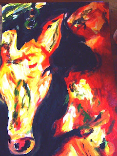
My thoughts on this piece, is that i'm not sure i like it as a painting, firstly the subject matter is quite grotesque, it's not like i am disgusted by it or anything, i just wouldnt want it on my wall. The palette is limited and quite dull, it is just not a painting that brings me any interest or joy. I do think it has strong imagery, and a definate theme to it, and the darker background really emphasises the shape of the carcuss and brings out the colours in the head of the calf.
To be honest i cant really relate to this painting, this is not what i would ever choose to paint, given the choice, i personally like to be quite realistic with my painting and this style of painting, quiet gestural, with the brush strokes showing doesnt appeal to me, maybe on a different subject but definately not this.
When i have been responding to this piece, initially in the class i was more trying to copy it rather than respond and i know sometimes that this is a problem for me, but choosing to use line, or scale or tone as a certain aspect to concentrate on really helps as you tend to concentrate on the formal property rather than trying to do a mark for mark perfect copy.
 I have layered the shapes to create depth and tried to cover the whole white paper so i wouldn't have to deal with 'white' background showing through, where there is slight amounts showing, i drew the shapes on larger to eliminate this.

 Here in these images you can see the colours layered over each other and the quite 'brushy' lines still evident.
 Howard Hodgkin

 Mark Rothko
 Mark Rothko
 Mark Rothko


